This report will cover the summary of the Metro Commercial Real Estate comparisons (comps) database ArcGIS dashboard. This project was decided to be completed because the comps database was often a bit of a mess. It contained features with a lot of missing data, some features that were repeated or out of date, and many inconsistencies.
That being said, the goal of this project was to clean up the data, fill in whatever missing information possible, and provide the brokers of Metro Commercial Real Estate with a new way to visualize the data. Before this, the process flow of the comps database was very simple. The comps themselves come from the brokers of Metro Commercial. Brokers will send sales and lease comparisons, or sales volumes, from outside sources that we then store in-house. Brokers will then reference these comps while they are making deals in certain areas. For example, a broker will request any comps in the Reading, PA area. The details can be further specified, such as stores with square footage more than 5,000, or only sale comps, etc. Then, the GIS team member will search the excel dataset for said town or city and those nearby. Any relevant comps are then sent over for the broker with any information available. Categories include:
- Type
- Square Footage
- Price
- Sales Volume
- Cap Rent %
- Location
- And More
This simplicity and lack of vision is why it was decided to provide a new form of deliverable with actual visualization and interactivity. Utilizing our ArcGIS subscription, a dashboard would be created that could be used by both GIS, or brokers themselves if they are an active ArcGIS online member.
The starting point of this project, and arguably the most time intensive, was to clean up the datafile storing the comps information. This process was done manually, feature by feature, cell by cell to all of the approximately 1,500 features.
First, completing missing address information and geocoding locations was essential to check for overlap, but to also provide spatial reference later in the dashboard. It would be rare for a single feature to contain all the possible stored information. Often, the features contained whatever information was provided by the brokers, with little investigation into the sights. Searching most locations was necessary to fill in blank information, such as shopping center names, correct address mistakes, and find geographic coordinates.
The features were then checked for overlap, or if any feature could be combined with another. For example, we may have one location with three different data features; one with lease information, one with sale information, and one with sales volumes or miscellaneous notes. A category defining the type of feature was added to aid for future filtering by brokers; the categories are either Lease, Sale, Both, Volume, or Miscellaneous.
Arc Online Comps Web Map:

First, the cleaned up comps database was loaded into ArcGIS online as a web map. This is the first element loaded into the dashboard. This is the one element that will need to be reloaded periodically. Brokers will continue to send comps to be added to the database, so the online dashboard will need to reflect this. When updated, a new layer can be saved in the web map with the same name, which will then be reflected in the dashboard.
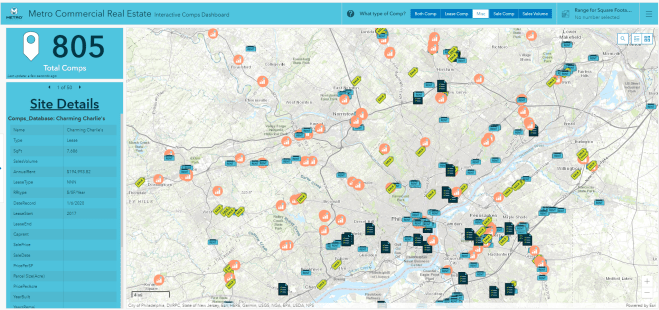
Comps Dashboard:

The dashboard contains a few elements that interact with the comps web map. The header contains the name of the dashboard, along with Metro Commercials’ logo and brand colors. The header allows the user to select what type of comp they are searching for through the categories named earlier: Lease, Sale, Both, Volume, and Miscellaneous. If the user is searching for only lease comps, they should select the Lease AND Both categories. This is important to remember because it refers to what the feature contains. Basically the Both category should always be selected, as it contains the most information including some with Sales Volumes. The header also contains a square footage range filter, if needed. This will allow the user to specify a minimum, a maximum, or a range to be searched.

When the user is ready to search the area of interest, they can do so simply by exploring the map themselves, or an address search bar is included to arrive at a specific address.

From there, the map can be zoomed in, out, or moved to observe the area of interest. The count of the Total Comps indicator will change accordingly to reflect what is being seen in the extent of the windowpane.

Any data points that are within the windowpane extent can be clicked individually to few the details available, or the Site Details section will list whatever details are available per site.

If a user of this dashboard ever needs a reference or guide to steps in this process, they can reference collapsible sidebar which clearly spells out the steps. This sidebar will also provide a brief explanation of the dashboard, but also a reminder to brokers to continue to send their outside comps to the GIS team to be added to the dataset.

The final product of this interactive dashboard has been successful and met with much positive feedback. The dashboard and database are updated regularly and used amongst team members often. The elimination of a somewhat unnecessary back and forth has led to more time efficiency amongst all members who utilize this dashboard.
