Every once in a while, I explore a topic or tool that I have never learned to use, or that I have not used in a long time. I recently was exploring making an animated time lapse in ArcGIS. Last week I created a dataset that contained a time field, so I thought this was a good time to re-familiarize myself with the process. That being said, the process is pretty simple, but upon exporting I realized that creating the animation from ArcMap sacrifices resolution quality.
If you haven’t noticed by now, I enjoy making .GIF images when displaying differences in time. This process may take more time, with much more exporting involved. However, I enjoy making the .GIF time lapse maps. They display important time-relevant information while ensuring a detailed image.
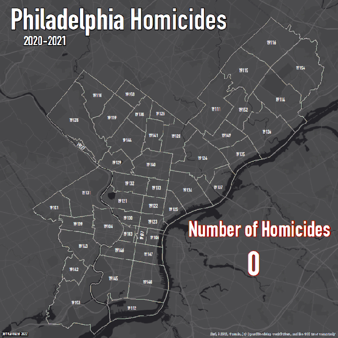
With all the gun violence in Philadelphia this past few years, I wanted to make a time lapse map that could help show the significance. I created a map showing the number of criminal-homicides in Philadelphia from 2020-2021. The map displays cumulative homicides in two month intervals with the final total being 917, a number that is nearly unbelievable and requires extreme investigation, analysis, and solution to aid in the city’s gun violence issue.
